MAK Electrical
Logo,
Stationery +
Website
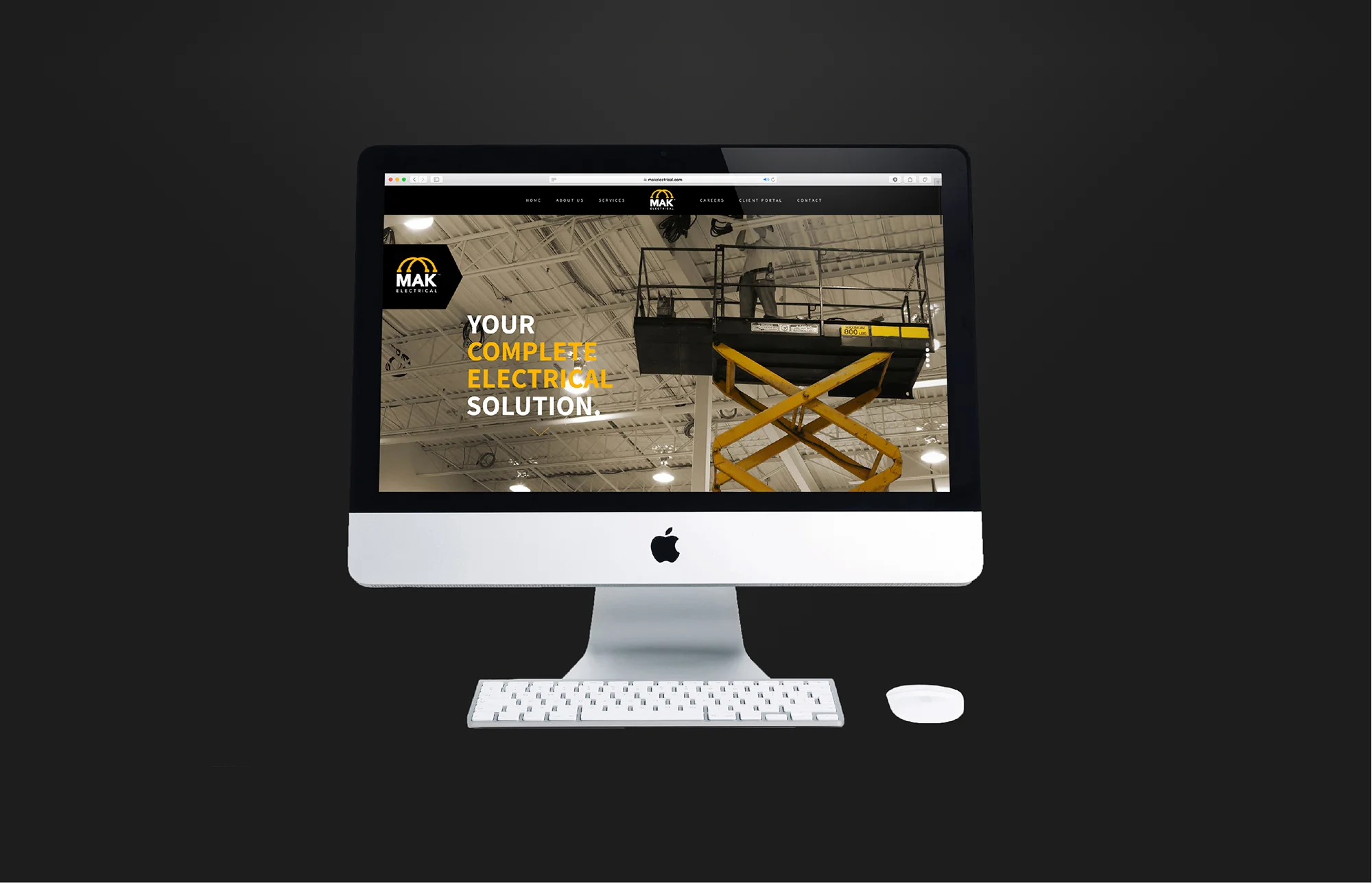
This full-service high quality electrical company needed to take its branding to the next level. They needed a new rebrand of their logo and a professional image presence to reflect the quality work they do.
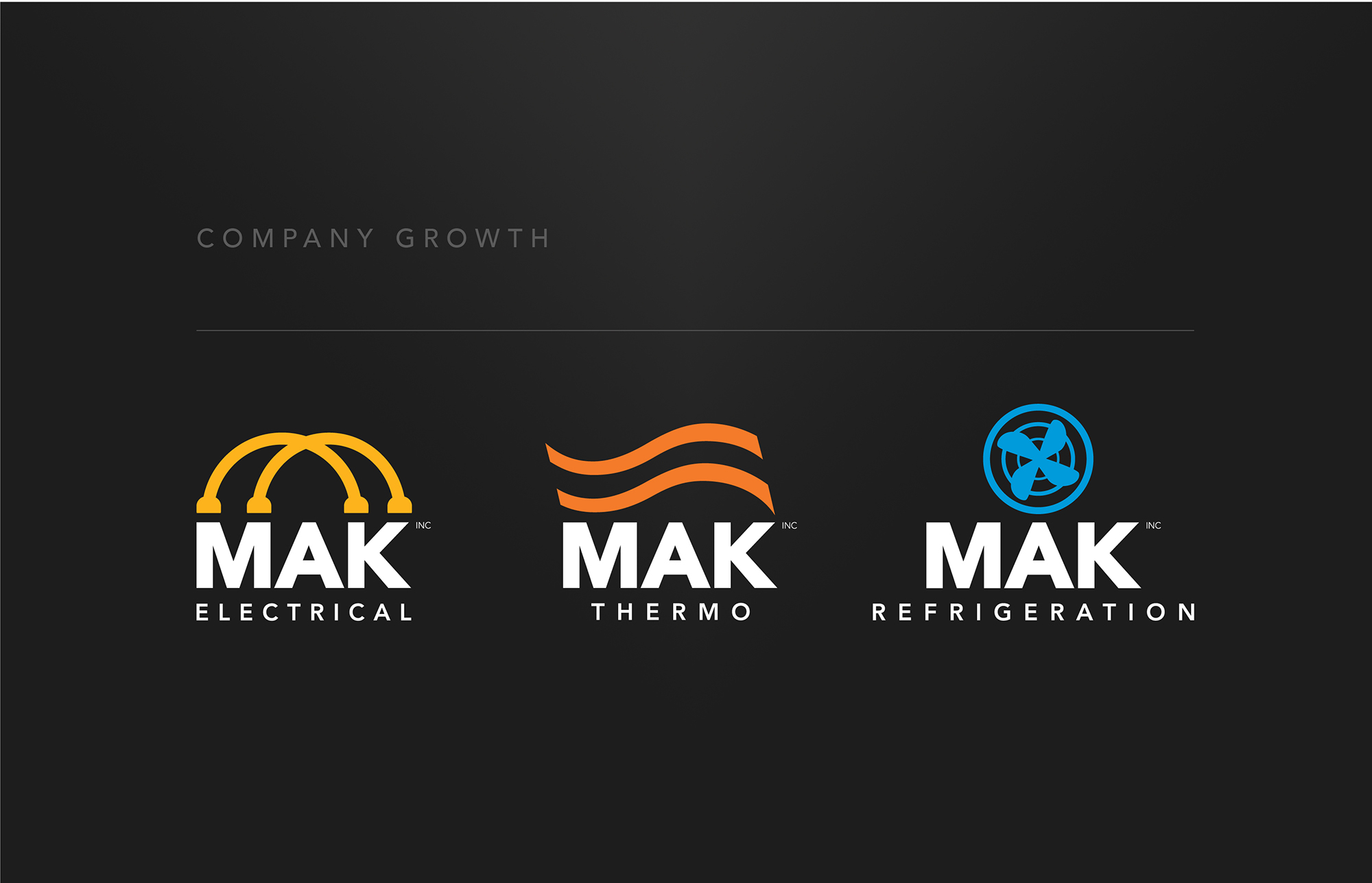
This was done by giving the logo a stronger corporate feel by changing the font to a sans serif geometric typeface in uppercase. The logo design had to represent the company and what it offered. After researching Industrial Electrical Panels and looking at the wiring, we added the wire element above the company name as a symbol for the company. We went for a strong, bold, confident color schemed of yellow/orange, black and white for the branding. Next was to design a website and stationery for a complete branding package. MAK Electrical also contacted us about designing logos for possible subsidiary companies.
Logo
Website
Stationery
Subsidiary Logos